Room B/A
Mattea Parker
See it On Campus: Level 2
Visitor InfoThe Concept:
Room B/A is a text adventure about text adventures. And identity. And growing up. And being a Roomba.
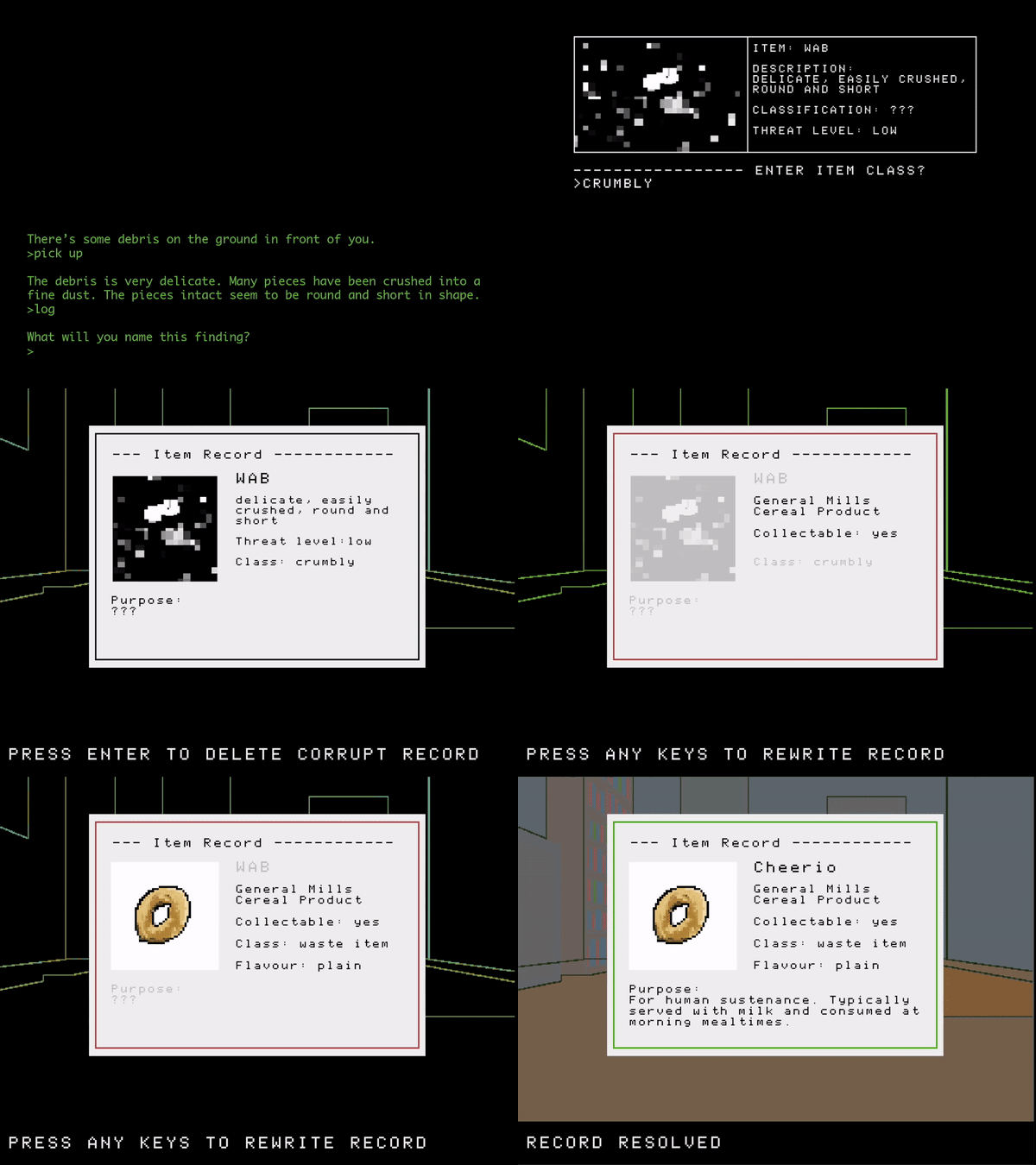
In this game, you play as an amnesiac explorer who awakes from their sleep pod in a strange and unknown place. You have no idea who you are. What you do know is your mission – to survey the environment and collect and catalog the foreign matter you come across. This loop of collection and visiting/revisiting rooms is repeated over three parts of gameplay. Each part explores a new day where your observational capabilities are expanded. This change in capabilities is expressed in the evolving interface and the added level of detail players are tasked with capturing in their catalog records.
At the end of the game, you realize your life and the world around you is not what it seems.
The Twist:
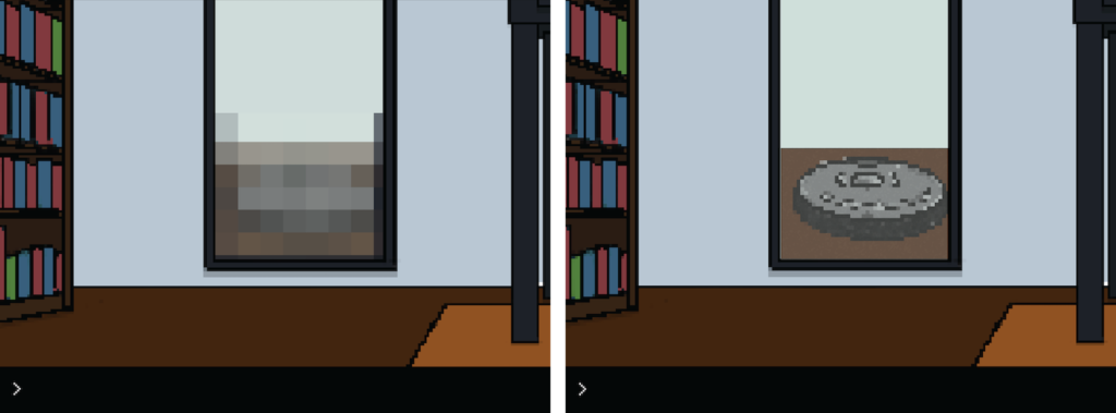
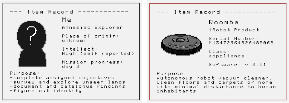
You are a Roomba. Your sleep pod is a Roomba Home Base™. Your mission is to revisit rooms and recollect debris because you are a vacuum. Your changes in observational abilities can be explained by operating system updates.
The Text Adventure Focus:
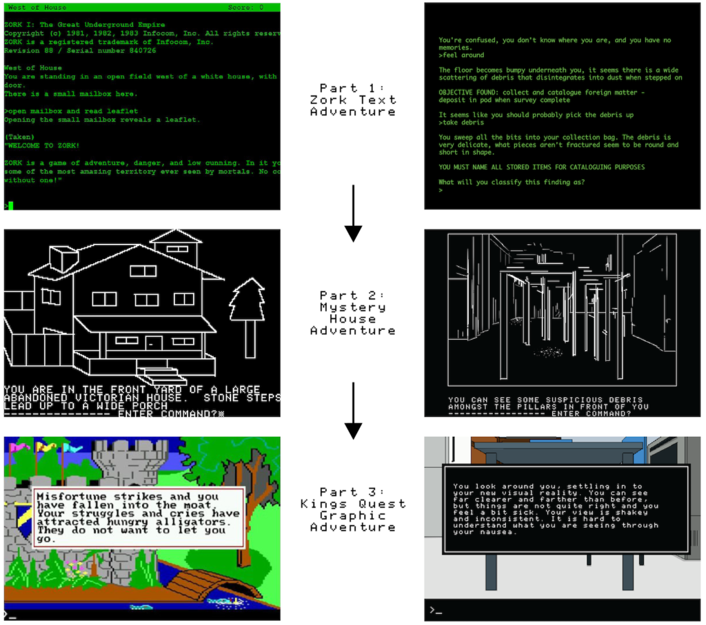
Although initially grounded in the text adventure genre – because it seemed like a fun style to emulate – this connection became much more important to the story and core of the game as the concept was further developed.

The modernization of the text adventure genre resulted in increasingly visual games with clearer and more restricted controls and interfaces. This nature of this evolution makes the genre a perfect vessel for delivering a story that explores how your understanding of self changes as you come to see the world in increasingly predefined ways. These changes in interface and shifts in technical limitations is directly tied into the story, connecting to the players capabilities and ability to understand the environment around them at different stages of gameplay.
Additionally, as a text adventure game, Room B/A can keep revealing details vague without raising suspicion. Small details that point to the Roomba reality can exist in plain sight, cloaked inside sci-fi elements and tone that is common to this genre. Primed to expect a text adventure game, a story about an amnesiac explorer on a sci-fi scouting mission doesn’t set off any alarm bells that would signal anything out of the ordinary.
Part 1:
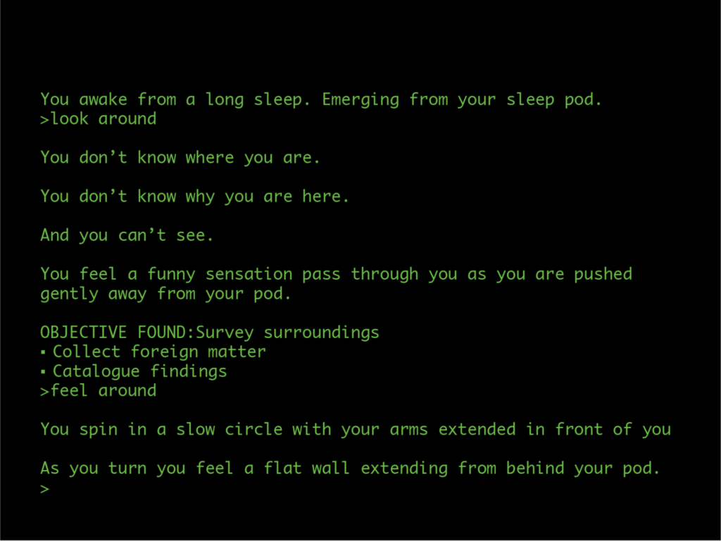
In part 1 the player is provided with very little information, all they know is that they have just woken from a sleep pod and have a mission to survey the environment around them. Both the player and character have limited preexisting understanding of their setting and have to make sense of the world around them for themselves.
At this point the game interface and style mirrors Zork, a classic text adventure game. With no pictures and only text, the interface aptly reflects the inability of the character to experience their surroundings visually.
To complete part one, players must fill their collection bag and return to their sleep pod. To fill their collection bag they must first explore all of the accessible rooms and discover, collect, name and log various mysterious objects.
Part 2:
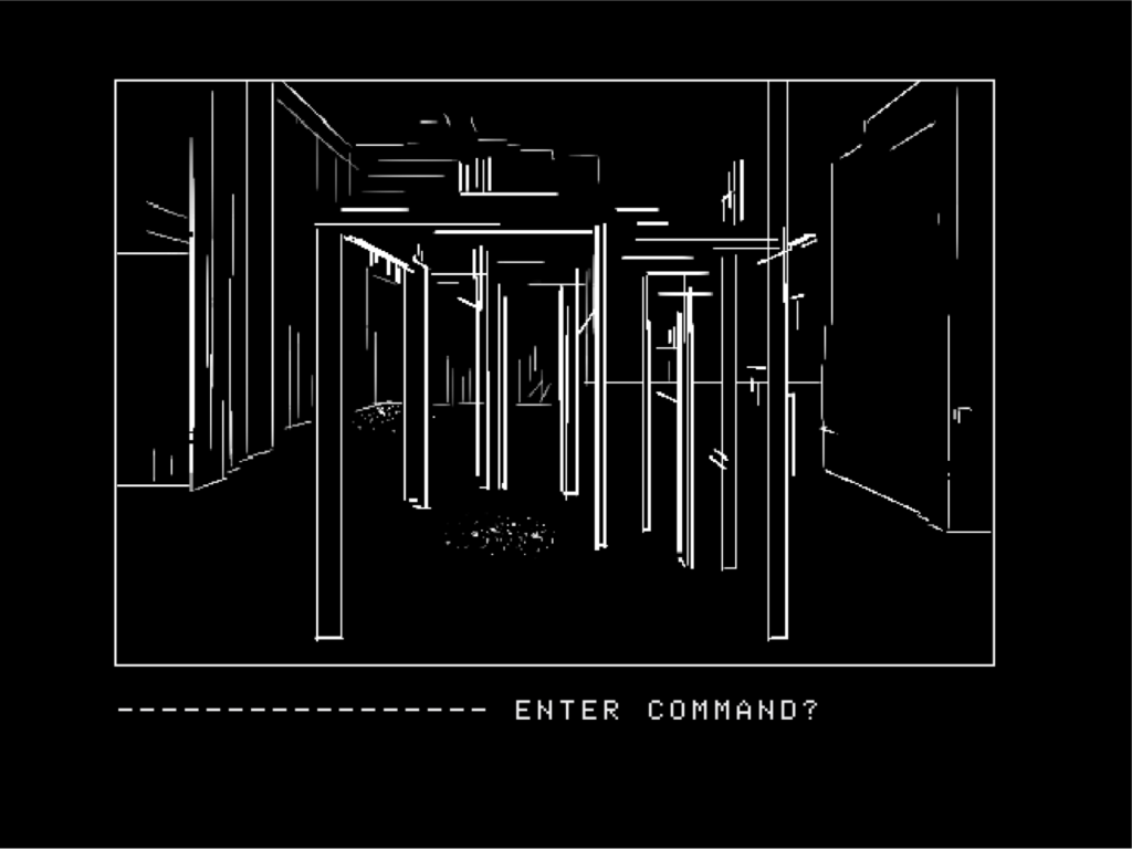
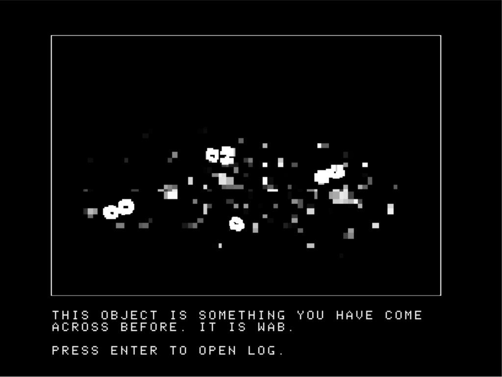
Part 2 takes place the next day. Here players are tasked with completing a similar set of objectives but with one significant change, now with added visual capabilities. This expands their ability to navigate and investigate the environment and allows for additional observations to be captured in their catalog records.
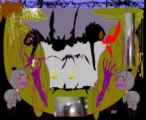
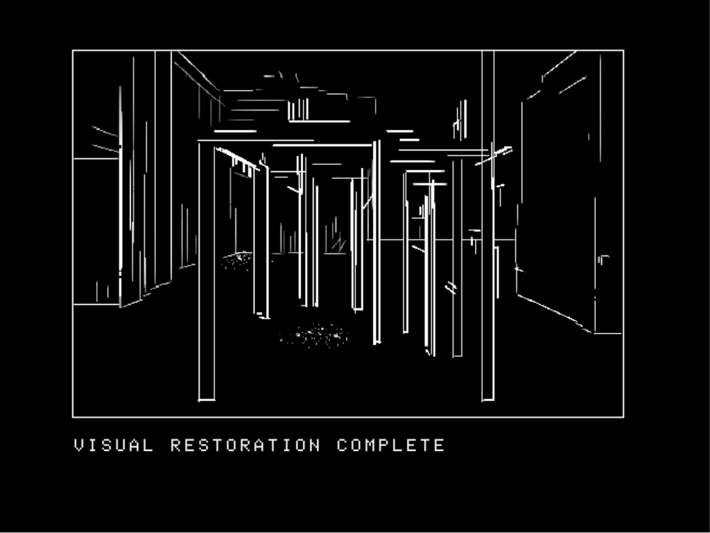
The change in interface and capabilities is inspired by Mystery House, the first text adventure game with pictures. The graphics are very limited, providing players with a general understanding of spaces and setting at its most simplified state. Mimicking Mystery House, Part 2’s vague and abstract graphics provide more information about the general structures and nature of the space without revealing specifics of the environment.
Part 3:
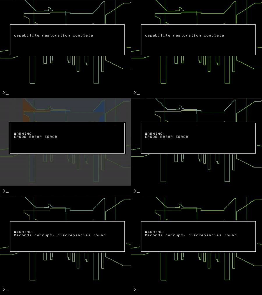
In part 3 players exit their sleep pod to discover another significant shift in interface. This expansion of visuals comes with a flickering and glitching effect that obscures their view. Players are warned that the only way to remedy this obstruction is to rewrite all their catalog records which have become corrupted.
The difference in this act of cataloging is that each record must be deleted entirely and players generate the new entries without control of their contents. They no longer have agency over the contents of records or interpretations of each object. Their role is only to delete and trigger the information reset.

The interface, visual style and added interaction constraints are inspired by King’s Quest, one of the first graphic adventure games that detached character movement and navigation from text commands. Eliminating the classic text adventure slog of “north, north, north, west, east” and replacing this with arrow key controls.
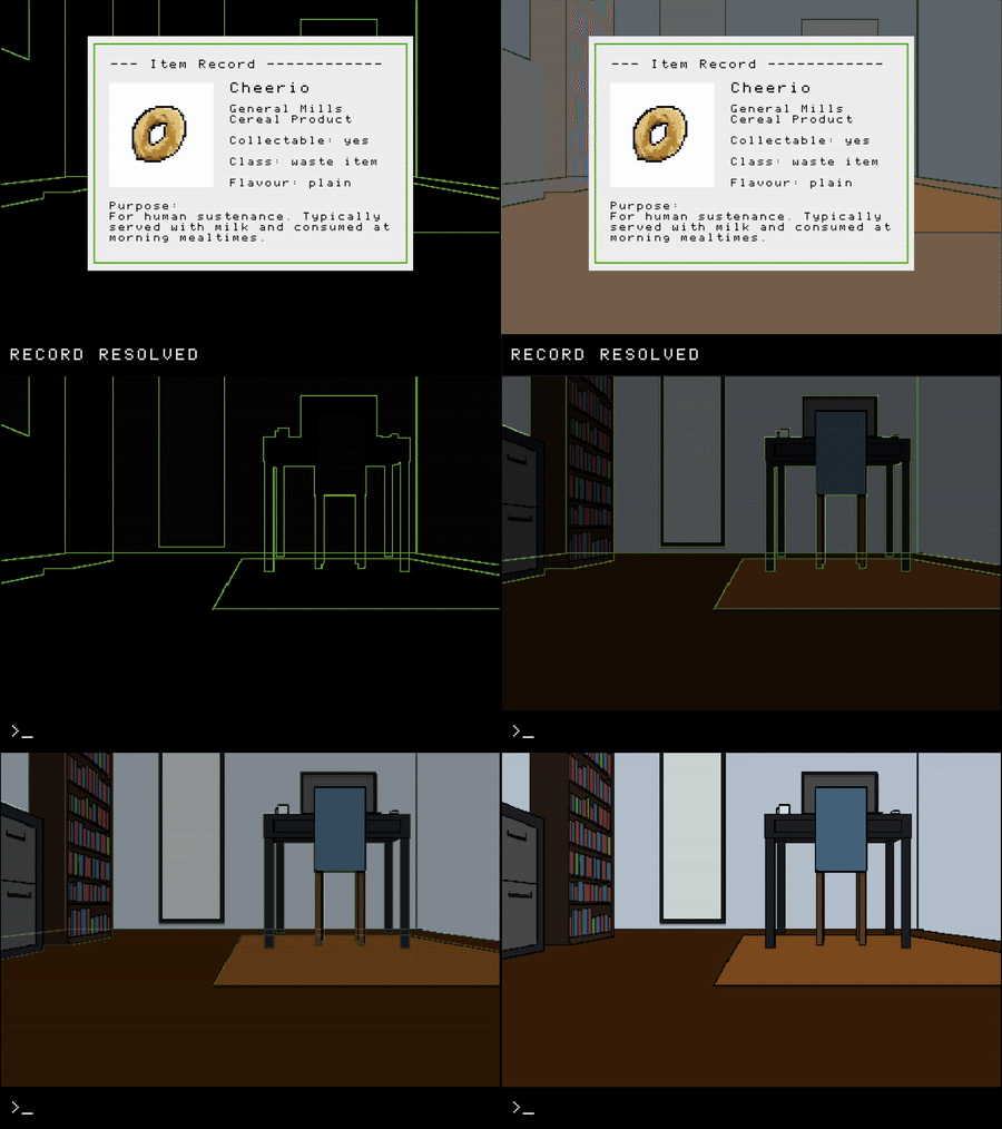
With each rewritten record the background imagery becomes clearer, revealing the reality of each room in an added level of detail. Once vision is fully restored players are left to grapple with the unexpected reality of their environment.
The Ending:
Once object records are resolved and players can see each room for what it really is, they are able to inspect their reflection in a mirror. This act opens a previously hidden record that describes their character. The player is then asked to delete and rewrite the record. The previous description of self as a mysterious adventurer is replaced with the truth. They are a vacuum cleaner.
Process Insights
Insight #1: Get your ideas in front of people and outside of your head
Early in this project’s development, I was really struggling on structuring the game flow and mechanics to best fit its story and concept: a game following the life of a growingly self-aware and existential Roomba. Here gameplay was focused on following an oblivious and increasingly sentient Roomba and guiding them to the revelation that they are an appliance with no higher life meaning or purpose besides cleaning the same rooms over and over.
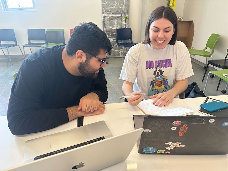
After a meeting with my peer mentor, they suggested that my game could end when the identity of the Roomba is finally revealed not only to the Roomba but also to the player.
This would mean keeping the player in the dark about the reality of their character’s identity – which makes for a much more compelling game, a more active and immersive experience of the story, and a more impactful ending. This was a necessary reframing that I couldn’t believe wasn’t part of the concept from the beginning.

Insight 2: Interactions should serve the story
Throughout this project, I generated a lot of ideas for additional game mechanics and minigames. These were pruned out over and over for similar reasoning: they didn’t add to, support, or align with the story and core of the game.
This is best reflected in the focus on catalog interactions, which were iterated several times to be most effective. The catalog interactions are designed to immerse players into the character of explorer on a mysterious exploratory mission and provide a feeling of agency over the interpretation of their environment. This forces players to play an active role in misrepresenting the reality of the world around them, reinforcing this interpretation and making for a more compelling experience.
Insight 3: Don’t give the ending away/the power of priming!
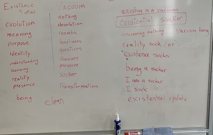
For the first half of this project, this game was titled Existential Roomba, a compelling title that felt right until it didn’t. Once the shift was made to keep the Roomba aspect of the game unsaid (until the end) – the title didn’t work for obvious reasons. This led to a lot of name workshopping that took place over several months.
Name journey:
Existential Roomba -> gives away the punchline
Existential Sucker -> doesn’t have the same charm
You Suck -> aggressive and sets self-loathing tone
Life Suck -> too much of a downer
Room B/A -> Eureka!
The title Room B/A works as a text adventure reference – where navigation between spaces and rooms makes up the majority of gameplay (moving between rooms A and B). Unlike the other titles, this one doesn’t prompt assumptions about the ending or the tone of the ending. Additionally, the use of capitalization and punctuation allows it to be read as “Room B slash A” or ‘Room B A” instead of “Room ba” keeping the Roomba reference just out of reach until you learn the deeper context of the game.

The final insight: Beware feature creep
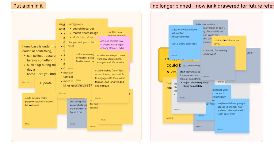
This is a lesson I relearn in most projects I work on. Although I haven’t been able to avoid it completely, my ability to catch myself earlier in big detours is greatly improving.
Effective strategies for combating this in this project have been by frequently seeking feedback, testing, experimenting, and refining core project goals and guidelines to check against and realign progress to.
Thank you
Big thank you to peer mentors Ember and Nikash and Professors Haig Armen, Eugenia Bertulis, and Ben Unterman for all the feedback, insights, and encouragement along the way! Special shoutout to Weijin and L for always being available to bounce ideas off of and for listening to a constant stream of video game history and Roomba facts despite having no particular affinity for video games or smart vacuum cleaners.

